You know how some logos just stick with you? Turns out, many of those familiar food logos have hidden messages that make them even cooler. From subtle nods to the company’s history to clever designs that convey more than meets the eye, these logos are full of surprises. Let’s dive into some of the sneaky hidden messages in your favorite food logos and see what secrets they’ve been hiding right in plain sight. Trust me, after you read this, you’ll never look at these logos the same way again!
Contents
Baskin-Robbins
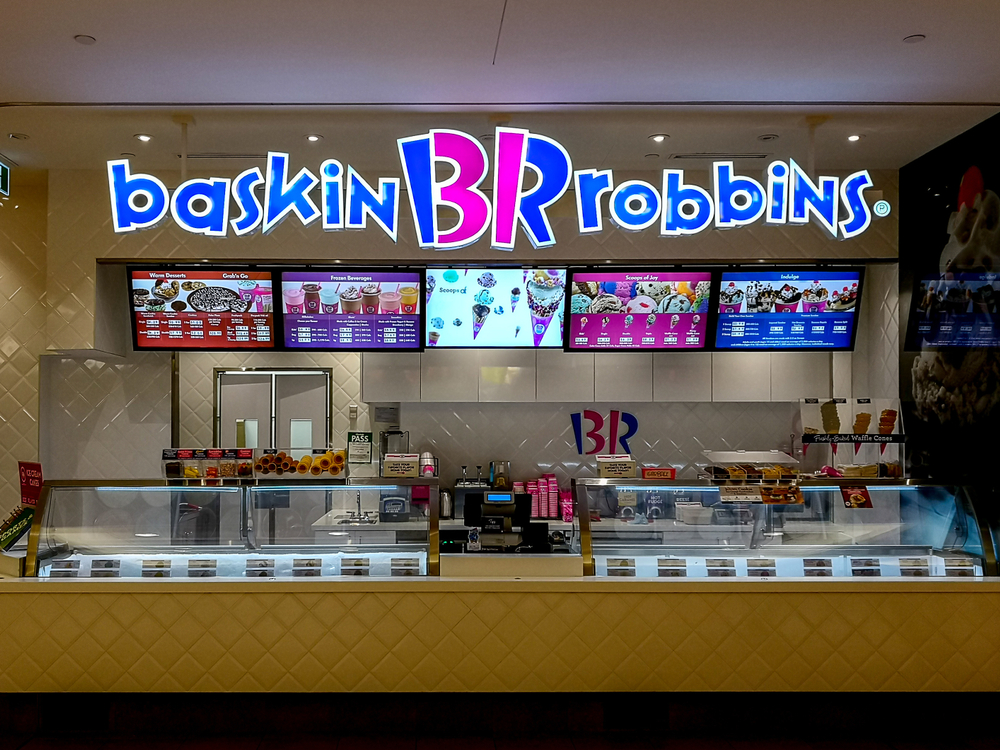
Baskin-Robbins is known for its “31 flavors” of ice cream, and this hidden message is cleverly embedded in the logo itself. The pink parts of the “B” and “R” form the number “31,” symbolizing their wide variety of flavors. This design choice has been a part of the logo since its introduction in 2005. The number 31 represents the company’s promise to provide a different flavor for each day of the month. It’s a subtle yet effective way to communicate the brand’s unique selling proposition. The logo design makes customers curious and delighted once they discover the hidden number.
Tostitos
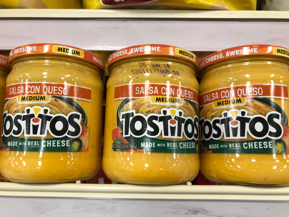
The Tostitos logo incorporates a fun and social element into its design. The two “T”s in the middle of the logo are designed to look like two people sharing a chip, with the dot of the “i” serving as a bowl of salsa. This design emphasizes the communal and social aspect of enjoying Tostitos products, making the brand memorable and engaging. By visually representing people enjoying their products, Tostitos fosters a sense of connection and celebration among its consumers.
Hershey’s Kisses
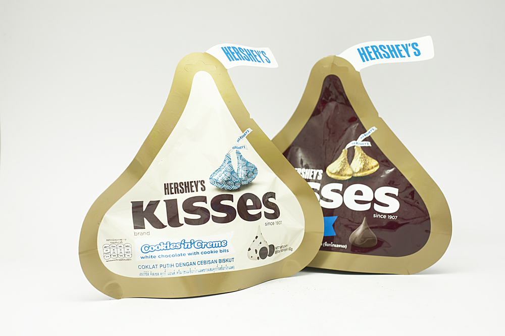
Hershey’s Kisses has a cleverly hidden image in its logo. If you look between the “K” and the “I,” you’ll notice an extra Hershey’s Kiss in the negative space. This design element is a subtle nod to the product itself, reinforcing the brand in a playful and imaginative way. The hidden kiss creates a moment of surprise and delight, enhancing the consumer’s brand experience.
Subway
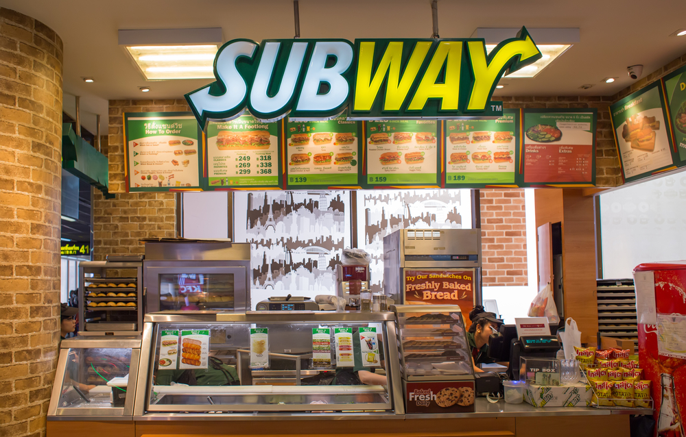
Subway’s logo features arrows at the beginning and end of the word, symbolizing the entrance and exit of a subway. This design reflects the brand’s name and its roots, cleverly incorporating the concept of a subway into the logo itself. The arrows suggest movement and direction, aligning with Subway’s fast-food service ethos. The clever use of arrows not only indicates a journey but also underscores the fresh and dynamic nature of the brand.
Nestlé
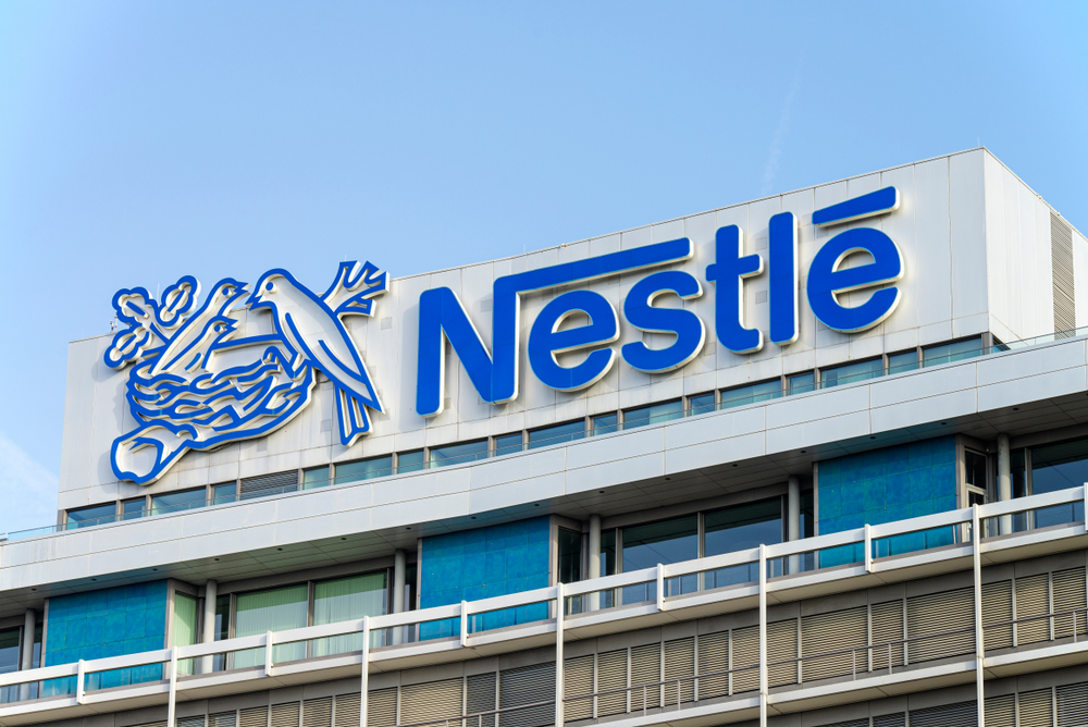
The Nestlé logo features a bird’s nest, which is a direct reference to the company’s name. The name “Nestlé” means “little nest” in German, and the imagery is inspired by the founder Henri Nestlé’s family coat of arms. This logo has been a part of the brand since its inception, symbolizing family and care. The nest symbolizes nurturing and growth, key values that align with Nestlé’s mission to provide quality products.
Heinz
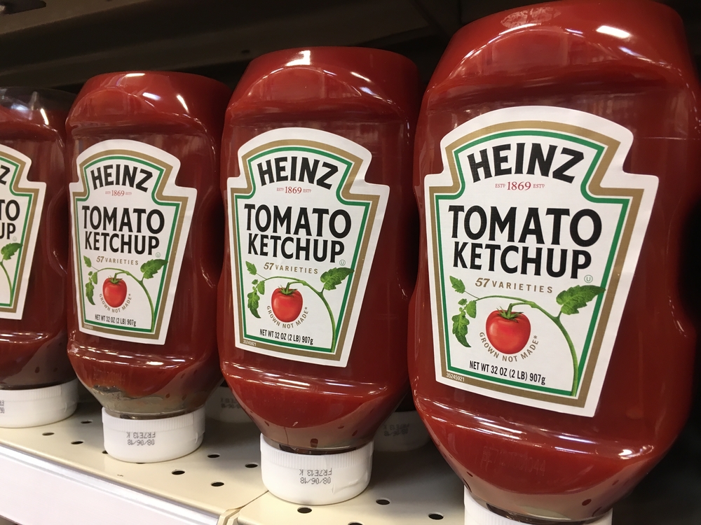
The Heinz ketchup bottle prominently displays the number “57,” which many assume represents the number of varieties the company offers. However, this is a myth. The number was chosen because it was the founder’s favorite number, and it has become an iconic part of the brand’s identity over the years. The persistent presence of “57” also exemplifies Heinz’s commitment to tradition and quality over time.
Twix
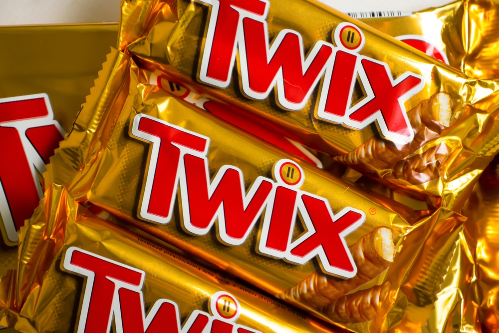
The Twix logo contains a subtle nod to its product. Inside the dot of the “i,” there are two tiny Twix bars, representing the dual nature of the candy bar. This clever inclusion highlights the brand’s unique selling point of offering two bars in one package. This visual cue subtly reinforces the concept of sharing and doubles the indulgence experience.
Burger King
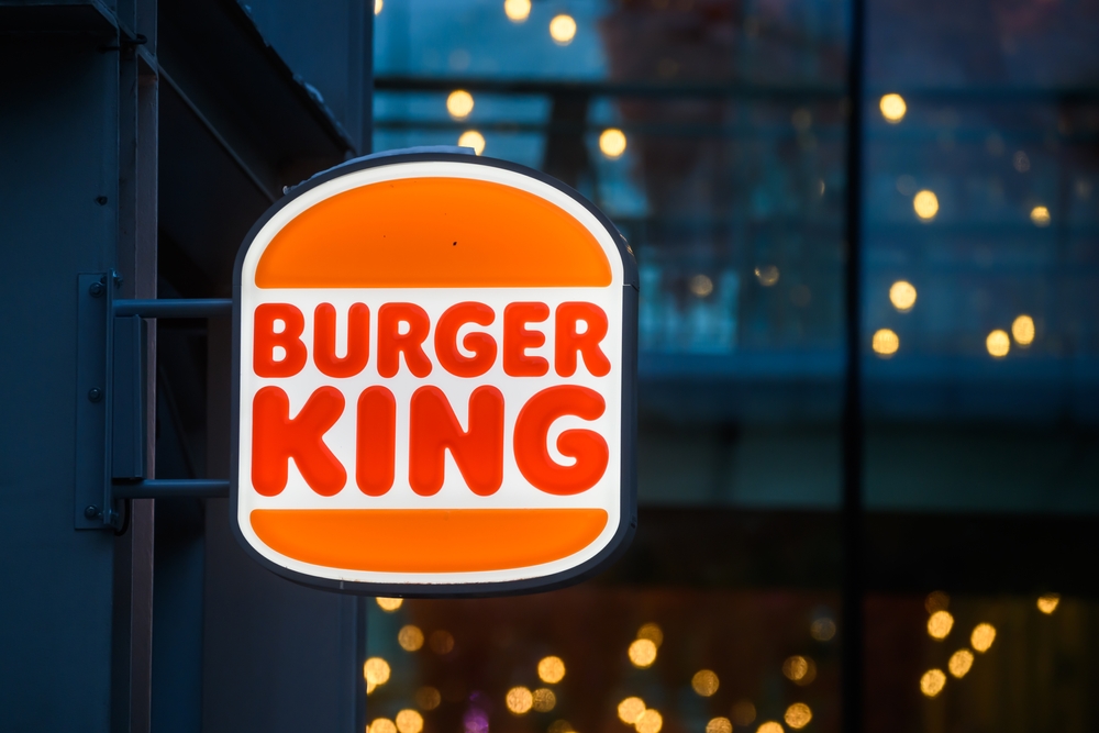
The Burger King logo features the brand’s name sandwiched between two buns, making the logo itself look like a burger. This design has been around since 1969, with minor updates over the years, and it clearly communicates the brand’s primary product in a straightforward and visually appealing manner. The playful design aligns with the brand’s fun and approachable image, inviting customers to enjoy a meal.
Orbit
Orbit gum’s logo features a circle divided into two halves: one dark and one light. This design represents the Earth’s orbit, symbolizing the day and night cycle. The logo’s celestial theme aligns with the brand’s name and adds a layer of sophistication to its design. This clever representation enhances the brand’s identity, connecting the product with a sense of freshness and global reach.
Wendy’s
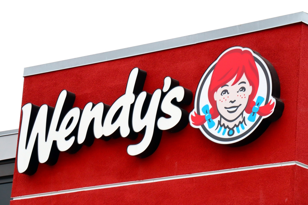
The Wendy’s logo subtly includes the word “MOM” in the collar of the character Wendy. This hidden message is meant to evoke feelings of home and comfort, reinforcing the brand’s image as a place for homestyle cooking. The message is subtle yet effective in connecting emotionally with customers. The inclusion of “MOM” also emphasizes the brand’s dedication to quality and care in their food preparation.
Toblerone
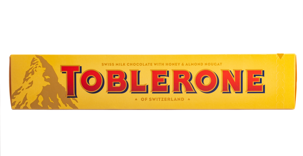
The Toblerone logo features a hidden bear within the mountain graphic, representing the city of Bern, Switzerland, where the chocolate was first created. The bear is part of Bern’s coat of arms, and this inclusion pays homage to the brand’s heritage and origin. This hidden element adds a layer of local pride and authenticity to the brand’s identity.
Lay’s
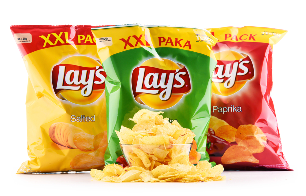
Lay’s logo features a red ribbon and a yellow sun, which is similar to the Frito Lay logo. These elements symbolize fun, warmth, and gatherings, aligning with the brand’s image of being a part of enjoyable moments and family gatherings. The use of these symbols reinforces the brand’s message and appeal. The cheerful design reflects the brand’s mission to bring joy and smiles through their snacks.
Milky Way
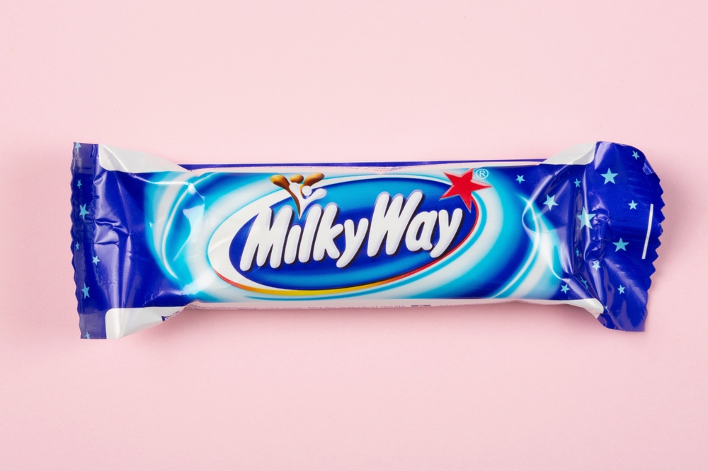
The Milky Way logo cleverly incorporates a swoosh that resembles the Milky Way galaxy. This design choice not only represents the brand’s name but also adds a dynamic and celestial feel to the logo, aligning with the brand’s theme of out-of-this-world indulgence. The celestial design element enhances the brand’s storytelling, creating a dreamy and indulgent image.
Duncan Hines
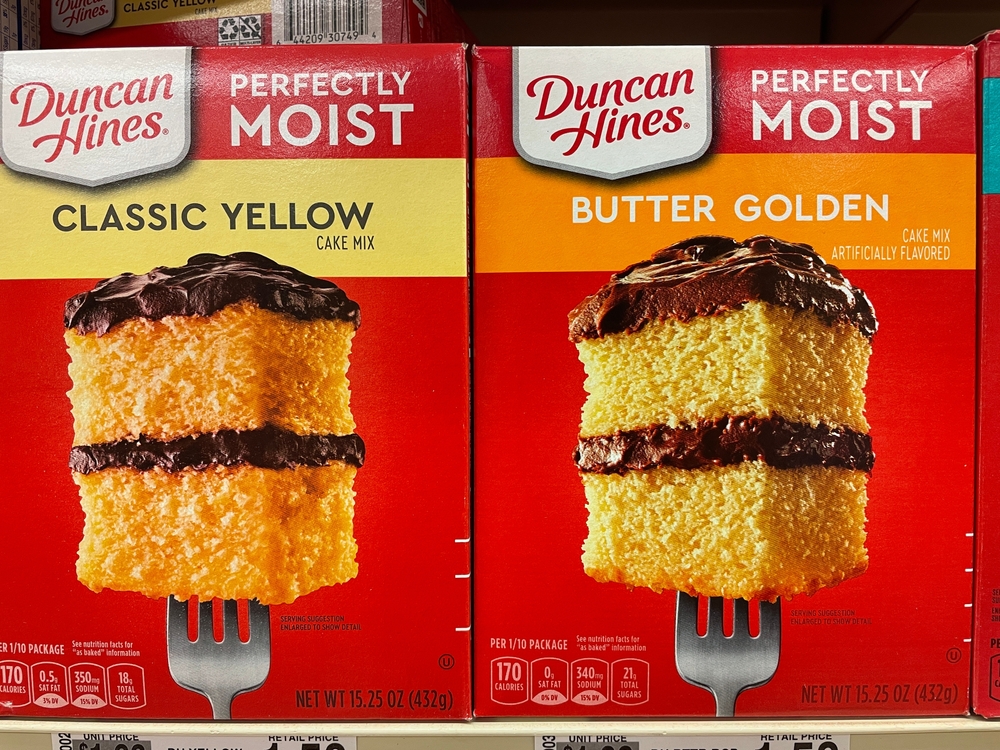
The Duncan Hines logo features a white section that resembles an open book, paying tribute to the company’s founder, who was known for his restaurant guides. This subtle design element honors Duncan Hines’s legacy and connects the brand’s past with its present product offerings. The book imagery highlights the brand’s historical roots in culinary expertise and reliable quality.
This article originally appeared on RetailShout
More From RetailShout
20 Frugal Mistakes That Actually End Up Costing You More

Cutting costs is often a smart move, but sometimes, trying to save a few bucks can backfire and end up costing more down the line. We’ve all been there, thinking we’re being thrifty, only to find out later that our frugal habits are actually draining our wallets. Read More.
17 Superfoods That Enhance Brain Function
Boosting your brainpower doesn’t have to be complicated or expensive. It’s all about making some simple, tasty additions to your daily diet. Imagine foods that not only satisfy your taste buds but also sharpen your mind and improve memory—sounds pretty awesome, right? Read More.
13 Things You Shouldn’t Overspend On During Retirement

Retirement is a time to enjoy the fruits of your labor, but it’s also important to keep an eye on your spending. With some careful planning and smart decisions, you can make sure your savings last and you don’t end up worrying about money. To help you out, I’ve put together a list of 15 things to avoid spending too much on in retirement. Read More.