Ever walked into a room and felt like the walls were closing in? It might not be the size of the room, but the way it’s decorated. Certain decorating choices can unintentionally shrink your space, making it feel cramped and cluttered. Here are some common decorating missteps that can make a room feel smaller, and how to avoid them to make any room in your home feel more open, inviting, and spacious.
Contents
- 1 Overcrowding with Furniture
- 2 Dark Wall Colors
- 3 Heavy Window Treatments
- 4 Too Many Patterns
- 5 Low Lighting
- 6 Cluttered Surfaces
- 7 Using Too Many Small Accessories
- 8 Improperly Sized Rugs
- 9 Ignoring Vertical Space
- 10 Over-decorating Walls
- 11 Neglecting Mirrors
- 12 Poorly Arranged Artwork
- 13 Low Ceilings with Overhead Lighting
- 14 More From RetailShout
- 15 ALDI’s 20 Sneak Peek Finds for the Week of 12/11/24 – 12/17/24
- 16 12 Awesome Gifts From Target You’ll Want to Grab
Overcrowding with Furniture
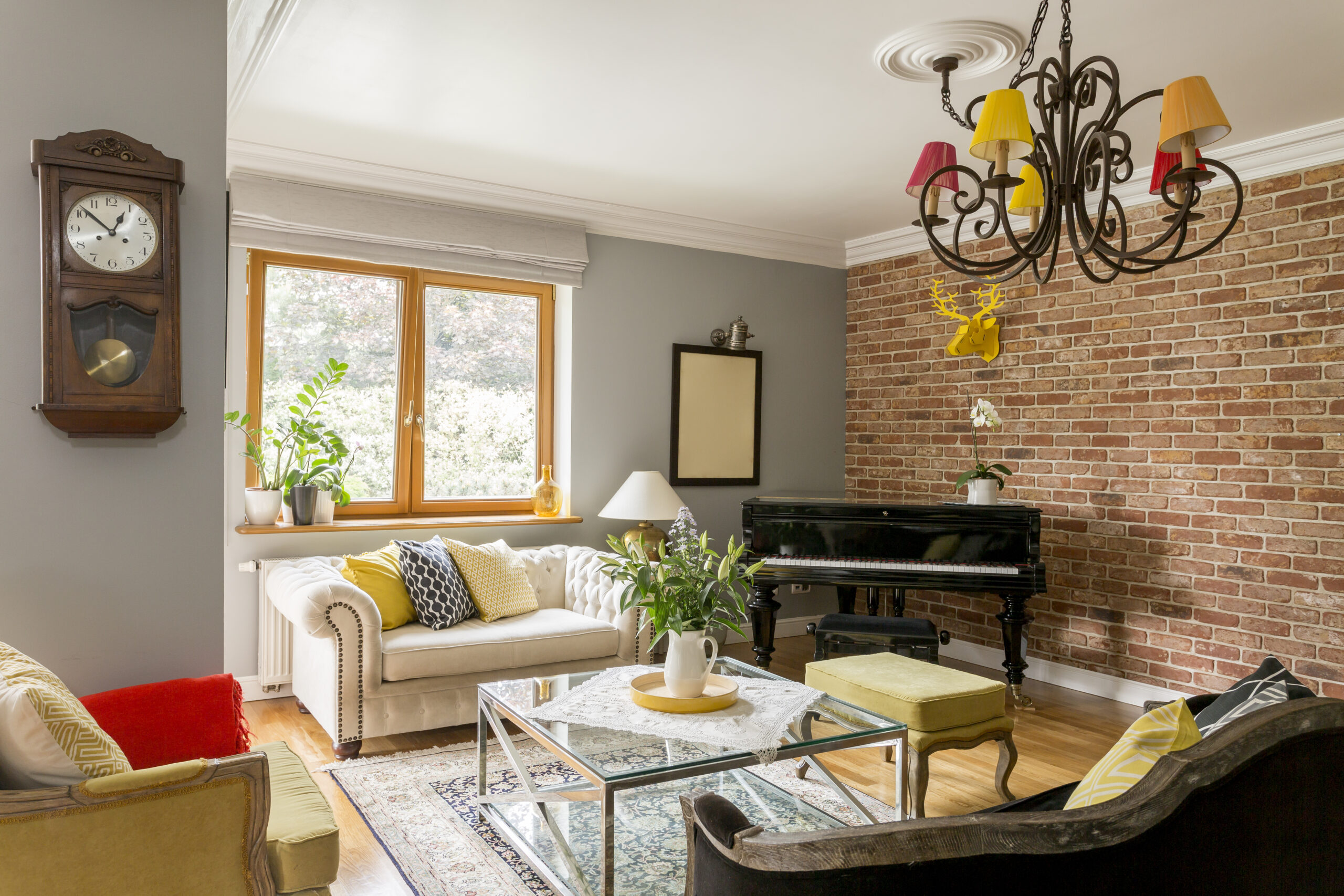
Filling a room with too much furniture can quickly make it feel cramped and closed in. Large pieces like oversized sofas or bulky armoires eat up valuable floor space and can block pathways, making the room less functional. Even if you love a cozy, lived-in look, it’s crucial to maintain balance and proportion. Opt for smaller, multi-functional furniture to keep the space open and airy. Allowing for ample walking space will make the room feel larger and more inviting.
Dark Wall Colors

While dark hues can create a dramatic and cozy atmosphere, they can also make a room feel much smaller than it is. Dark colors absorb light, which can diminish the sense of space in the room. To avoid this, consider using lighter shades on the walls, which reflect more light and create a sense of openness. If you love dark colors, use them in accents or on one feature wall to maintain a feeling of spaciousness. Bright, reflective surfaces can also counterbalance darker tones.
Heavy Window Treatments
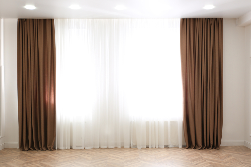
Thick curtains or drapes can give a room a luxurious feel, but they can also block natural light and make the space seem smaller. Light, airy fabrics like linen or sheer curtains allow more sunlight to filter in, expanding the perceived size of the room. If you prefer privacy, consider using blinds or shades that can be pulled up during the day to maximize light. Mounting curtains higher and wider than the window frame can also create the illusion of larger windows. Always consider how your window treatments impact both light and space.
Too Many Patterns
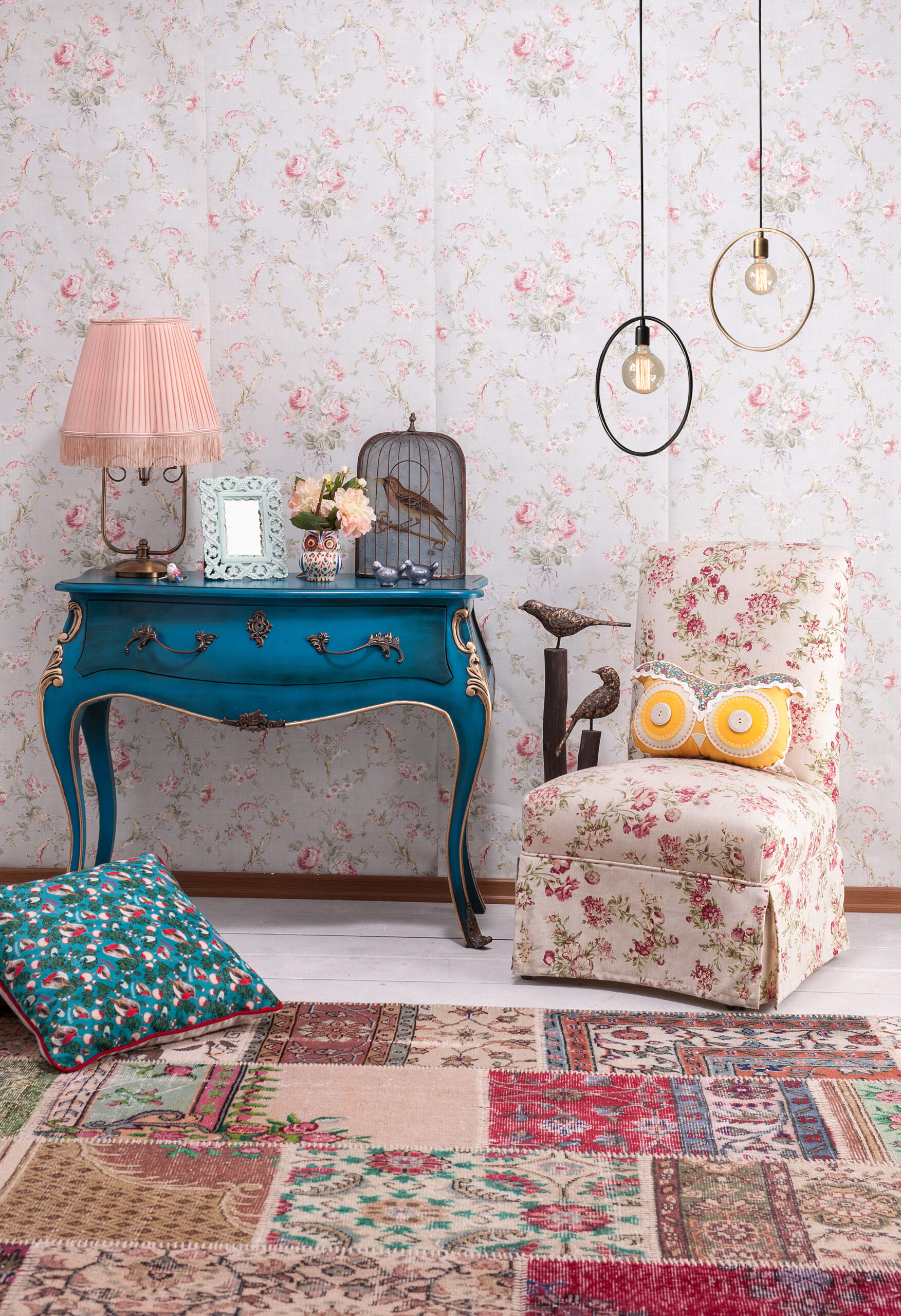
Patterns can add character and depth to a room, but too many conflicting patterns can overwhelm the space and make it feel cluttered. Mixing patterns requires a delicate balance; it’s important to ensure they complement rather than compete with each other. Stick to a cohesive color palette and vary the scale of patterns to maintain visual harmony. Alternatively, use patterns sparingly, focusing on accent pieces like throw pillows or rugs. This approach keeps the room from feeling busy and crowded.
Low Lighting
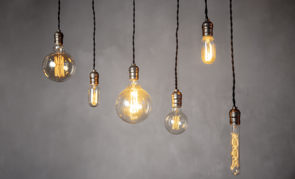
Insufficient lighting is one of the most common mistakes that can shrink a room visually. Relying on a single overhead light source can create shadows that make the space feel confined. Layering different types of lighting, such as floor lamps, table lamps, and wall sconces, helps to brighten the entire room and create a more spacious feel. Consider adding dimmers to control the intensity of light and avoid overly harsh lighting. Proper lighting can open up a room, making it appear more welcoming and expansive.
Cluttered Surfaces
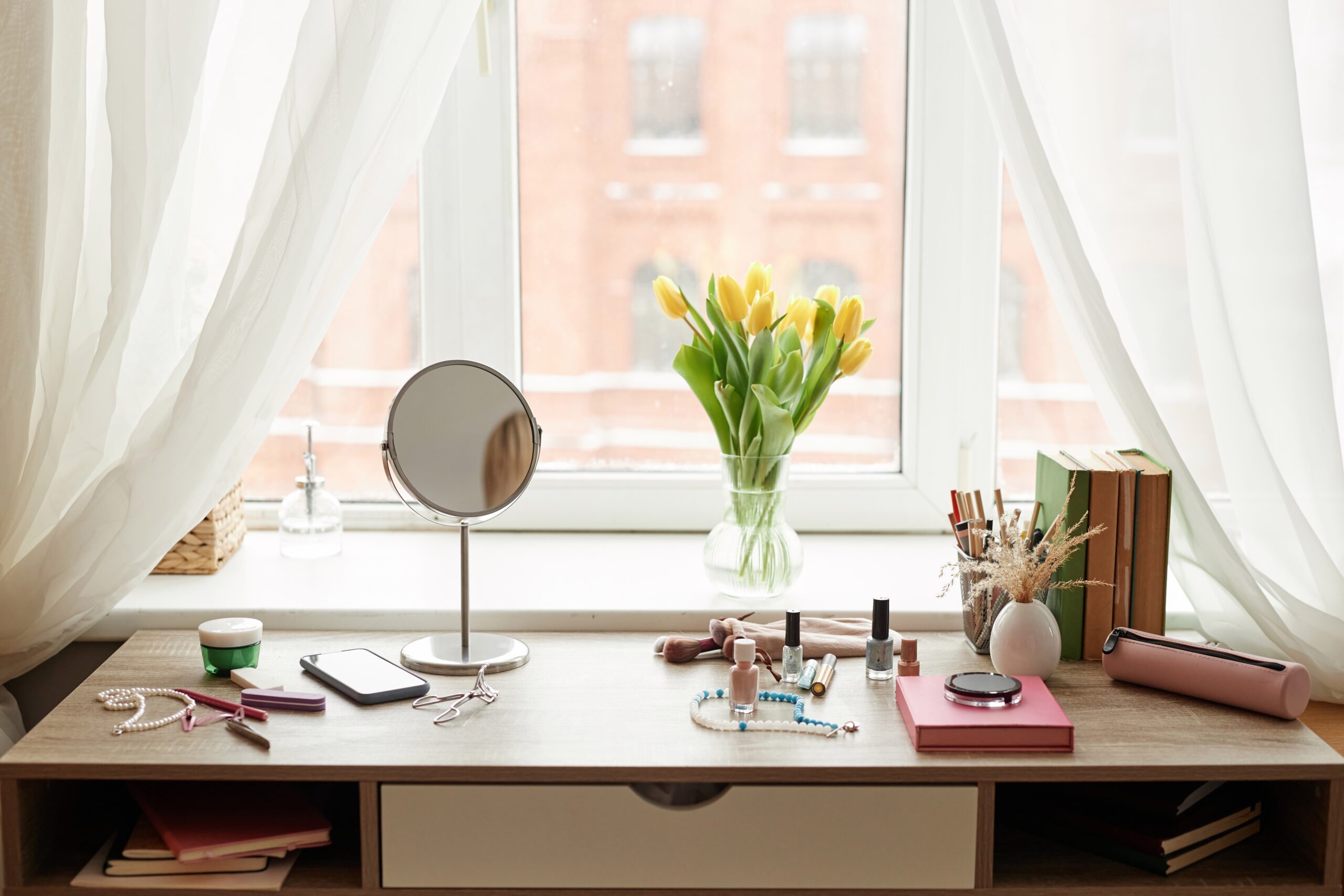
Clutter on surfaces, such as tables, countertops, and shelves, can make a room feel smaller and more chaotic. It’s easy to accumulate items, but too many knick-knacks can overwhelm the space and detract from its overall design. Keep surfaces clear by using storage solutions like baskets, trays, or decorative boxes. Aim for a minimalist approach, displaying only a few key pieces that add character without overwhelming the room. This creates a clean, organized environment that feels more spacious.
Using Too Many Small Accessories

While small decorative items can add personality to a room, too many can lead to visual clutter, making the space feel crowded and smaller. Instead of scattering tiny trinkets around the room, focus on a few larger statement pieces that draw the eye. Grouping items together can create a cohesive look, rather than spreading them out, which can make the room feel disjointed. Scale is important; larger accessories can actually make the room feel bigger by providing clear focal points.
Improperly Sized Rugs
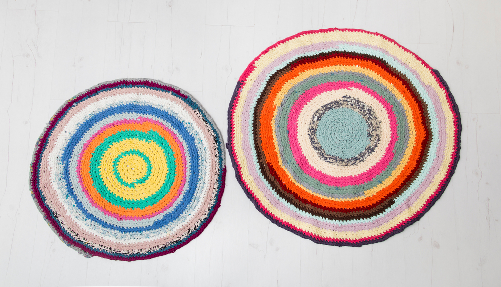
A rug that’s too small for a room can make the space feel disjointed and confined. When a rug is undersized, it can visually chop up the floor space, making the room appear smaller. To avoid this, ensure that your rug is large enough for all the furniture to sit on top of it, or at least have the front legs of the furniture on the rug. This unifies the space and makes it feel larger and more cohesive. A properly sized rug can anchor a room, making it feel both bigger and more inviting.
Ignoring Vertical Space
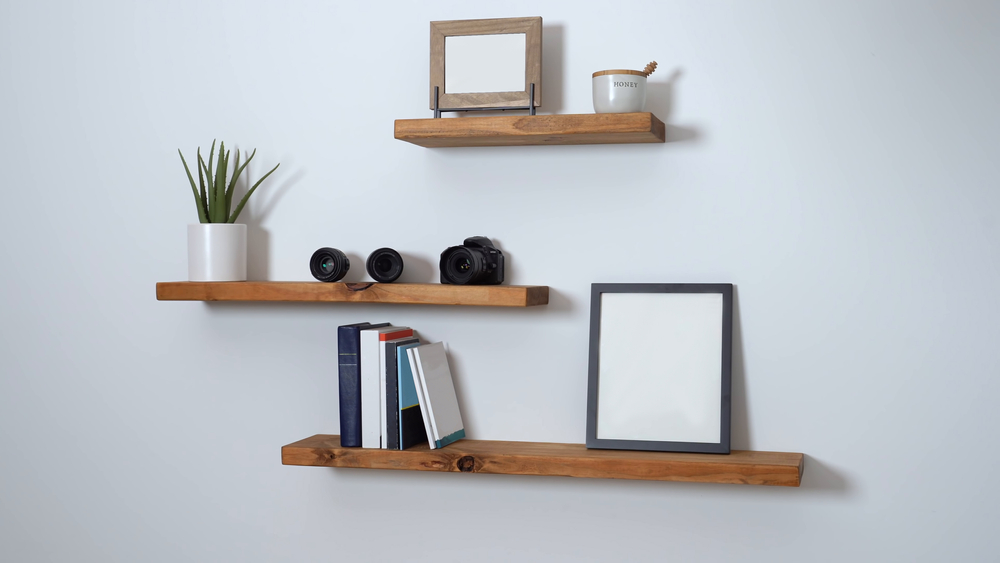
Neglecting vertical space is a common mistake that can make a room feel shorter and more cramped. Utilizing the height of the room can draw the eye upward, making the space feel larger. Install tall shelves, hang curtains from ceiling height, or add artwork higher up on the walls to create the illusion of height. Vertical storage solutions not only help declutter the room but also make use of otherwise wasted space. Incorporating vertical elements can significantly enhance the room’s overall sense of spaciousness.
Over-decorating Walls
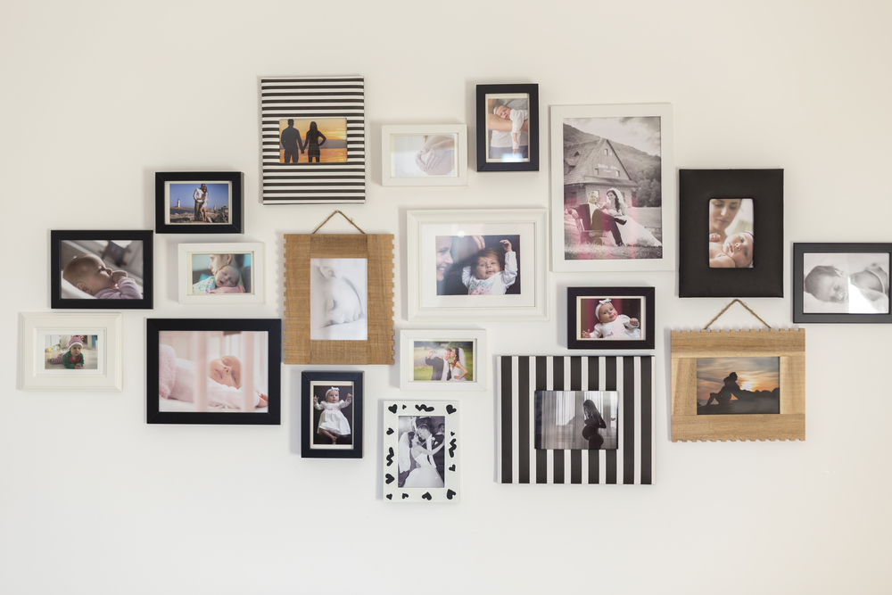
While it’s important to personalize your space, overloading the walls with artwork, photos, or decorative items can make a room feel busy and smaller. A wall that’s covered in various items can overwhelm the senses, making the room feel chaotic. Instead, choose a few favorite pieces and arrange them thoughtfully, leaving some negative space to let the room breathe. Large-scale art or a single statement piece can be more effective in making a room feel bigger. Simplicity often leads to a more open and airy feel.
Neglecting Mirrors
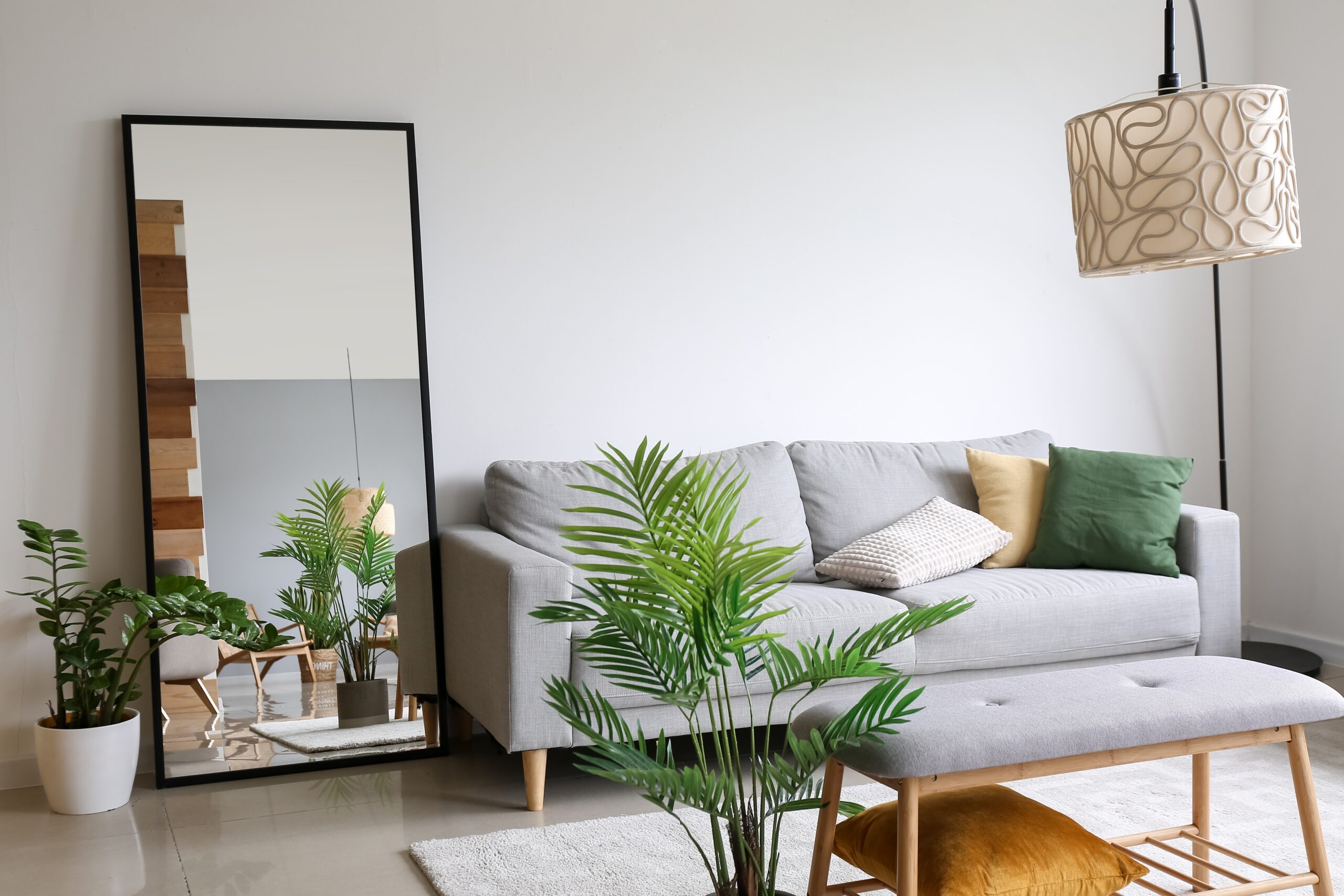
Mirrors are a powerful tool for creating the illusion of space, but they are often overlooked or used ineffectively. A well-placed mirror can reflect light and make a room feel twice its actual size. Consider placing a large mirror opposite a window to maximize natural light or using a series of smaller mirrors to create a gallery effect. Mirrors can also serve as decorative focal points, adding both style and a sense of openness. Don’t underestimate the impact of strategically placed mirrors in enlarging a space.
Poorly Arranged Artwork
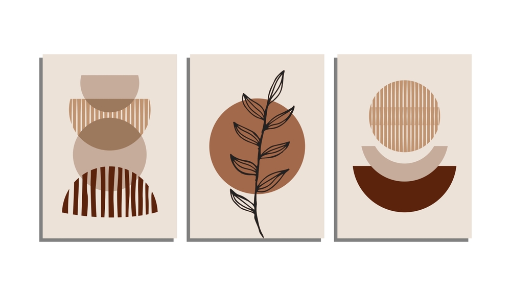
Artwork that is hung too high, too low, or in an awkward arrangement can throw off the balance of a room and make it feel smaller. The placement of art should be at eye level and in proportion to the wall space and furniture below it. Grouping smaller pieces together or using a large statement piece can enhance the sense of scale in the room. Art should complement the room’s dimensions, not detract from them. Thoughtful placement can help create a more spacious and balanced environment.
Low Ceilings with Overhead Lighting
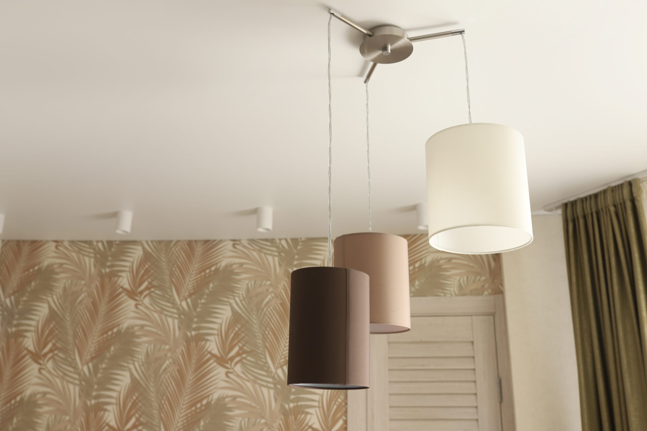
Using overhead lighting exclusively in rooms with low ceilings can create a boxed-in, claustrophobic feel. Chandeliers or pendant lights that hang too low can accentuate the lack of vertical space, making the ceiling seem even lower. To counter this effect, consider using flush-mount or semi-flush-mount fixtures that don’t intrude into the space. Wall sconces and floor lamps can also help spread light evenly without drawing attention to the ceiling height. A well-lit room with appropriately placed lighting can feel taller and more open.
This article originally appeared on RetailShout.
More From RetailShout
This Week’s 13 Hottest Finds at Costco (12/08/2024)

Costco never fails to surprise shoppers with incredible finds, and this week is no exception. From seasonal treats to must-have gadgets, the aisles are packed with items that offer value and quality. Read More.
ALDI’s 20 Sneak Peek Finds for the Week of 12/11/24 – 12/17/24
The holiday season just got even better with ALDI’s latest Sneak Peek finds! Whether you’re sprucing up your home, searching for thoughtful gifts, or snagging fun treats for the family, this week’s lineup has something for everyone. Read More.
12 Awesome Gifts From Target You’ll Want to Grab

Target is one of the best places to find unique gifts that everyone will love, whether you’re shopping for a friend, family member, or treating yourself. From cozy home goods to cool gadgets, Target has something for every occasion. Read More.


