Sometimes, it’s not just the food we remember—it’s the packaging that leaves a lasting impression. Those clever designs, bold colors, and unique shapes often become as iconic as the flavors they hold. From candy wrappers to soda bottles, some packaging has stood the test of time, earning a permanent place in pop culture and our hearts. Let’s take a moment to appreciate some of the most recognizable food packaging designs ever created.
Contents
- 1 Campbell’s Soup Can
- 2 Coca-Cola’s Contour Bottle
- 3 Pringles Canister
- 4 Toblerone Chocolate Bar
- 5 McDonald’s Happy Meal Box
- 6 KFC Bucket
- 7 Heinz Ketchup Glass Bottle
- 8 Hershey’s Chocolate Bar Wrapper
- 9 Oreo’s Blue Wrapper
- 10 Pepsi Can
- 11 Nutella Jar
- 12 Lay’s Potato Chip Bag
- 13 M&M’s Packaging
- 14 KitKat Wrapper
- 15 Cheerios Box
- 16 Starbucks Coffee Cup
- 17 More From RetailShout
- 18 15 Dollar Tree Office Supplies You Didn’t Know You Needed
- 19 14 Best Online Markets for Organic and Locally Sourced Produce
Campbell’s Soup Can
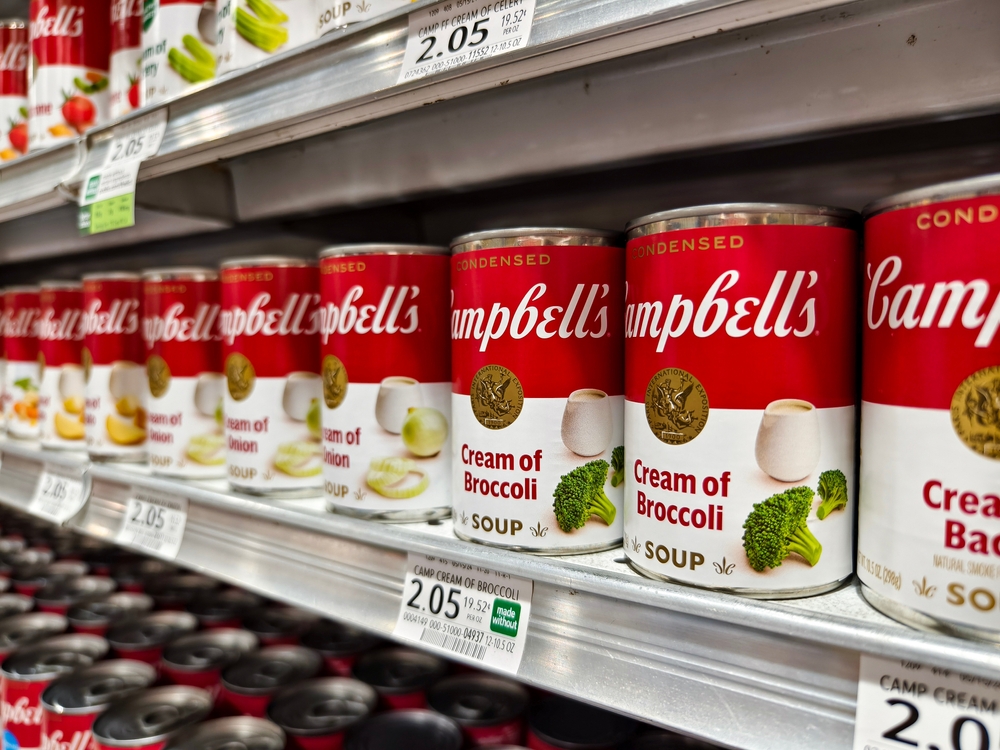
Introduced in 1898, Campbell’s Soup cans feature a distinctive red and white color scheme inspired by Cornell University’s football uniforms. The design gained cultural significance when artist Andy Warhol used it in his pop art, further cementing its iconic status. The minimalist layout, with the brand name prominently displayed, has remained largely unchanged for over a century. This consistency has helped the packaging become synonymous with canned soup in American households. The can’s design is so influential that it’s part of the Museum of Modern Art’s collection.
Coca-Cola’s Contour Bottle
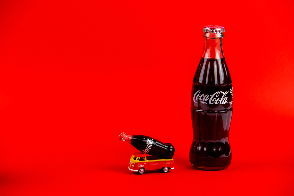
In 1915, the Coca-Cola Company introduced its contour bottle, designed to be recognizable even in the dark. The bottle’s unique shape and fluted lines set it apart from competitors and have become a symbol of the brand worldwide. Over the years, the contour bottle has been featured in various art forms, including works by Andy Warhol, highlighting its cultural impact. Despite numerous packaging innovations, Coca-Cola continues to use this classic design, underscoring its timeless appeal. The bottle’s design is so iconic that it has been granted trademark status by the U.S. Patent and Trademark Office.
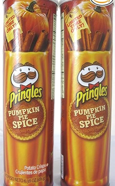
Pringles Canister
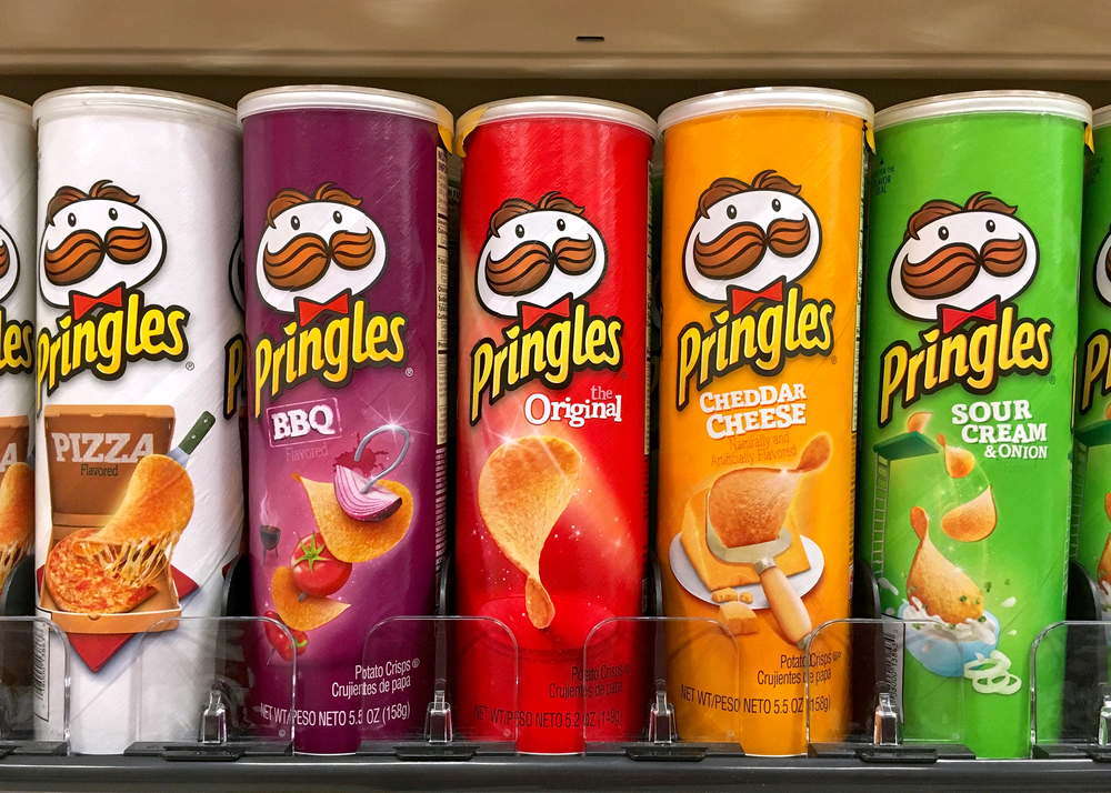
Launched in 1968, Pringles introduced a cylindrical canister to stack their uniformly shaped chips, a departure from traditional bagged snacks. This innovative packaging, designed by chemist Fredric Baur, protects the chips from breaking and keeps them fresh longer. The can’s design also allows for efficient storage and stacking on store shelves, making it both functional and distinctive. The Pringles can has become so iconic that it was inducted into the U.S. National Inventors Hall of Fame in 2004. Its unique shape has made it a standout in the snack food industry.
Toblerone Chocolate Bar
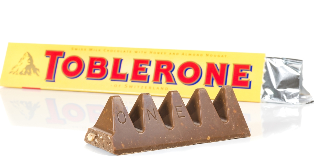
Toblerone’s triangular packaging, introduced in 1908, mirrors the Swiss Alps’ Matterhorn peak, reflecting its Swiss heritage. The unique shape not only distinguishes it visually but also influences the way consumers break and share the chocolate. The honey and almond nougat-filled chocolate has maintained this packaging for over a century, becoming a popular souvenir and gift item. The design is so distinctive that Toblerone has taken legal action to protect it from imitation. Its packaging has become synonymous with premium Swiss chocolate.
McDonald’s Happy Meal Box
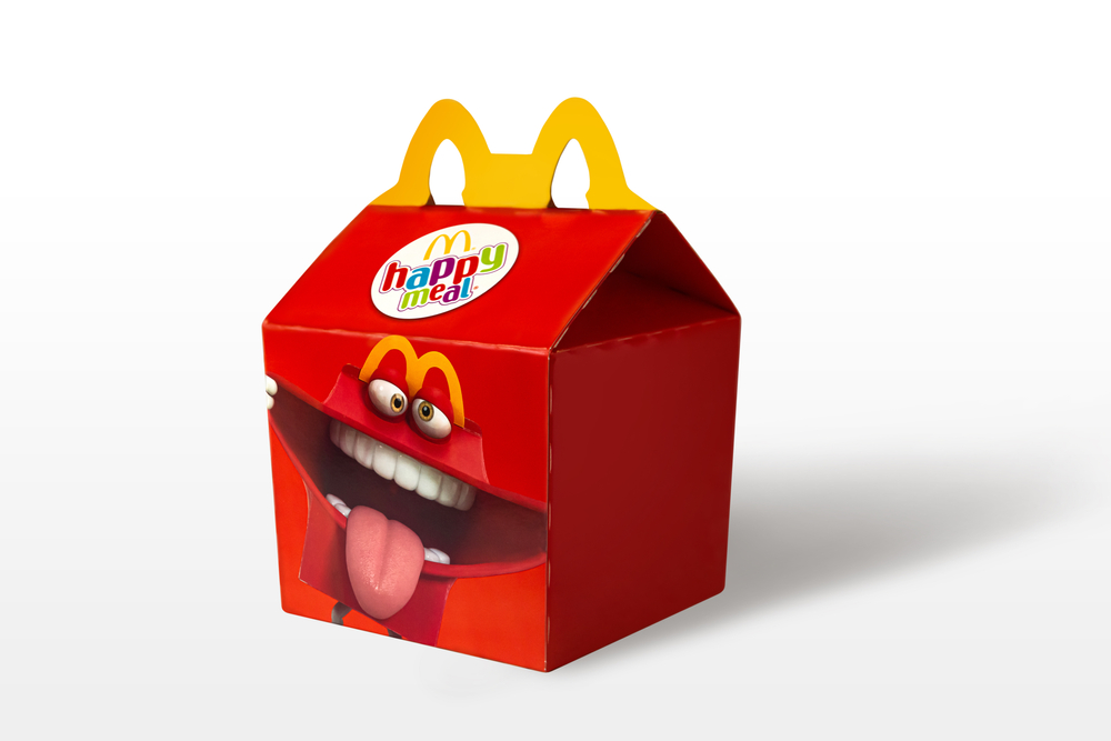
Introduced in 1979, the McDonald’s Happy Meal box features a bright red design with the brand’s golden arches serving as a handle. Aimed at children, the packaging includes a toy and has become a symbol of childhood joy and fast-food culture. The box’s design has been adapted for various promotions and collaborations, keeping it relevant over the years. Despite these changes, the core elements remain, making it instantly recognizable worldwide. The Happy Meal box has been credited with revolutionizing children’s marketing in the fast-food industry.
KFC Bucket
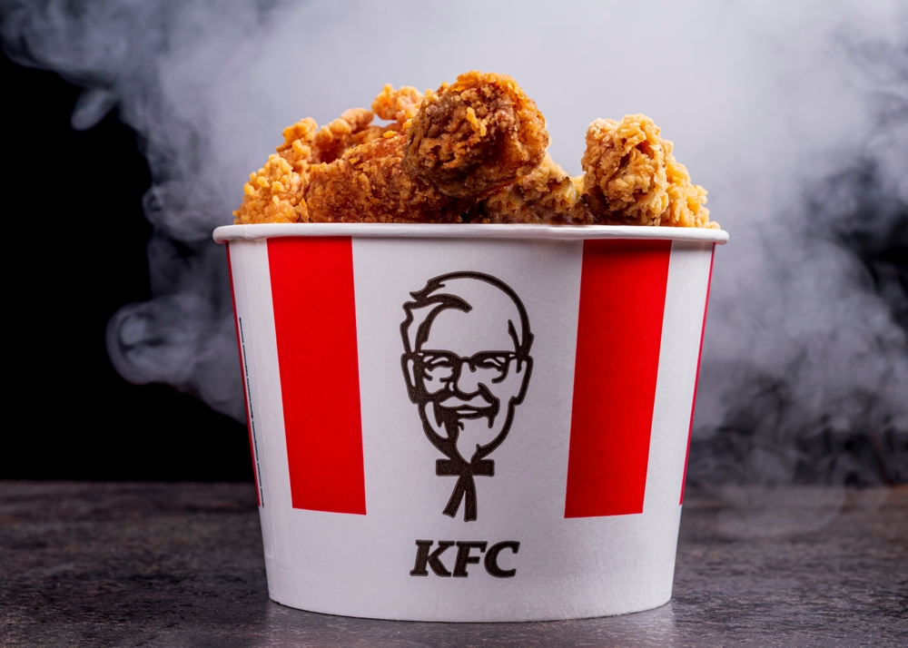
The KFC bucket, introduced in 1957, features a red and white design with Colonel Sanders’ image, becoming synonymous with the brand’s fried chicken. Initially created to package larger quantities for families, the bucket has become an integral part of KFC’s identity. Over the years, the design has seen slight modifications but has retained its core elements, ensuring brand consistency. The bucket’s portability and convenience have contributed to its enduring popularity. It’s not just packaging; it’s a cultural icon representing communal dining experiences.
Heinz Ketchup Glass Bottle
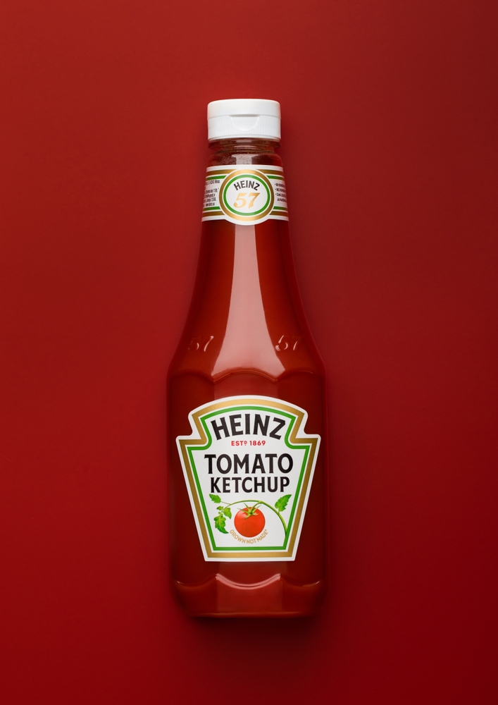
Introduced in 1876, the Heinz ketchup glass bottle features a clear design that showcases the product’s quality and purity. The octagonal shape and the embossed “57 Varieties” logo have become iconic elements of the brand. Despite the introduction of squeezable plastic bottles, the glass bottle remains a staple in restaurants and households. The bottle’s design is so iconic that it has been featured in art exhibits and is part of the Smithsonian’s collection. Its slow-pouring ketchup has even led to the term “Heinz ketchup effect” in physics, describing the sudden flow of a thick fluid after initial resistance.
Hershey’s Chocolate Bar Wrapper
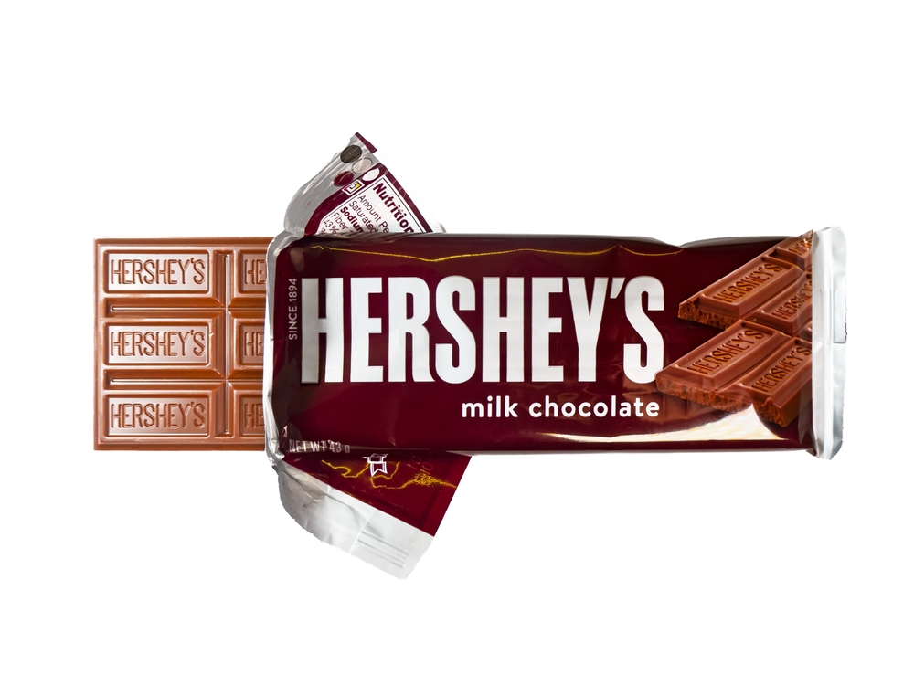
Since its introduction in 1900, Hershey’s chocolate bar has featured a simple yet effective brown and silver wrapper. The design prominently displays the brand name in bold, capitalized letters, making it easily identifiable. Over the years, the wrapper has seen minimal changes, maintaining its classic look to preserve brand recognition. The consistent packaging has helped Hershey’s become one of the most recognizable chocolate brands in the United States. The wrapper’s design is so iconic that it has been used in various merchandise, including clothing and accessories.
Oreo’s Blue Wrapper
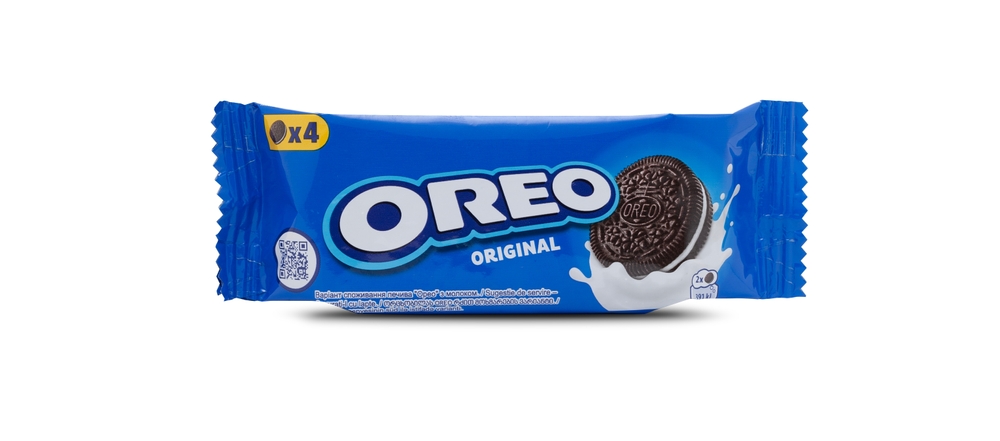
Oreo’s blue packaging has become a defining feature of the brand since its introduction in 1912. The iconic design uses bold, contrasting colors to highlight the Oreo name, making it instantly recognizable on store shelves. Over the years, the packaging has included variations to reflect new flavors and limited editions while maintaining its signature branding. This consistency has made it synonymous with cookies and milk. The blue wrapper also emphasizes the product’s premium quality and timeless appeal.
Pepsi Can
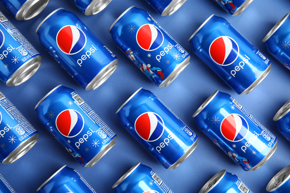
The Pepsi can’s design has evolved significantly since its first appearance in 1898 but remains one of the most iconic beverage packaging designs. Its red, white, and blue color scheme reflects the American heritage and has been central to its branding. The circular logo, with its dynamic wave pattern, symbolizes energy and refreshment. Pepsi regularly updates the can’s appearance to stay modern while preserving key elements that ensure instant recognition. The packaging continues to capture the brand’s innovative and youthful image.
Nutella Jar
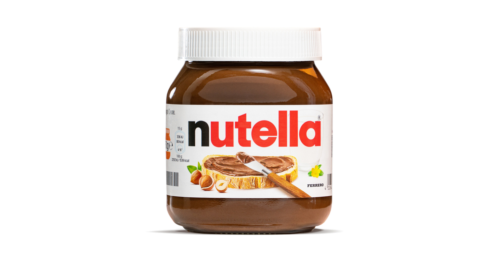
Nutella’s clear jar with a white lid and bold logo has become an enduring symbol of the beloved hazelnut spread. Its transparent packaging highlights the product’s creamy texture and rich color, appealing to customers visually. The design includes an illustration of bread with a Nutella spread, emphasizing its versatility as a breakfast or snack option. The jar’s shape and size are also practical for home use, making it a staple in many households. This packaging has helped Nutella maintain its global popularity and premium image.
Lay’s Potato Chip Bag
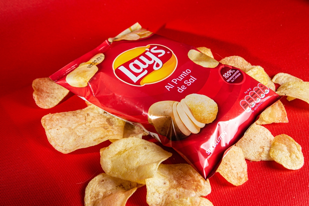
Lay’s colorful foil bags, introduced in 1932, are designed to keep the chips fresh while grabbing consumers’ attention. The vibrant yellow packaging for the classic flavor has become instantly recognizable worldwide. Each bag prominently displays the brand’s logo and an image of the chips inside, creating an appetizing visual appeal. The packaging includes easy-to-read flavor labels, ensuring clarity for consumers. This combination of functionality and attractive design has made Lay’s a market leader in the snack industry.
M&M’s Packaging
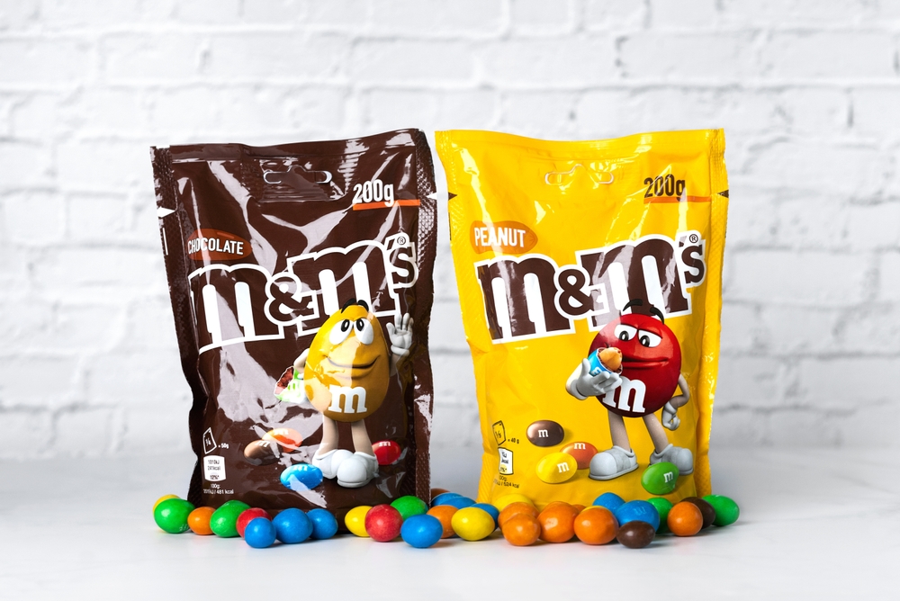
The bright, playful packaging of M&M’s candies, introduced in 1941, reflects the brand’s fun and vibrant personality. The design prominently features the brand name in bold letters and the slogan “Melts in your mouth, not in your hand.” Clear windows on some packaging allow consumers to see the colorful candies inside, enhancing visual appeal. Over the years, the packaging has been adapted for various seasonal and promotional themes while maintaining its core design. This timeless packaging has helped M&M’s remain a favorite across generations.
KitKat Wrapper
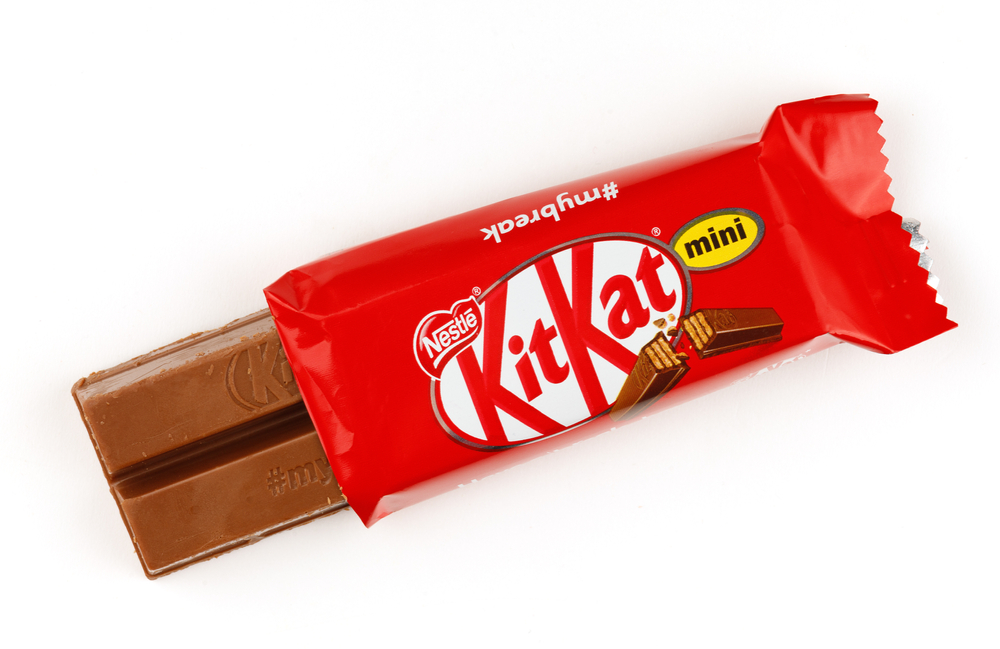
The bright red KitKat wrapper with white lettering has been a hallmark of the brand since its launch in 1935. Its simple yet effective design conveys energy and vibrancy, appealing to consumers worldwide. The phrase “Have a Break, Have a KitKat” is often featured on the packaging, reinforcing its branding and association with relaxation. The wrapper is easy to open, adding convenience to the snacking experience. This recognizable packaging has helped KitKat maintain its position as one of the top chocolate brands globally.
Cheerios Box
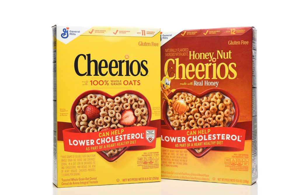
Cheerios’ signature yellow cereal box, introduced in 1941, has become a staple in breakfast aisles. The design highlights the product’s heart-healthy benefits, often displaying a red heart on the front. Its simplicity, combined with clear messaging about nutritional value, resonates with health-conscious consumers. The packaging also features playful branding, such as the use of a single Cheerio in the logo, emphasizing its iconic shape. Cheerios’ packaging continues to appeal to both children and adults, making it a household favorite.
Starbucks Coffee Cup
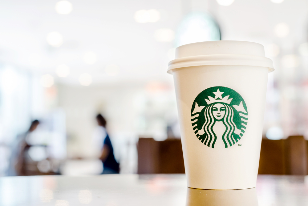
The Starbucks white cup with its green mermaid logo has become a cultural phenomenon since its introduction in 1987. Its minimalist design symbolizes sophistication and quality, aligning with the brand’s premium coffee offerings. The cups often include seasonal or promotional designs while retaining the iconic logo, ensuring brand recognition. Starbucks’ use of customizable names on the cups has added a personal touch, enhancing the customer experience. This packaging has transcended its practical purpose, becoming a symbol of coffee culture worldwide.
This article originally appeared on RetailShout.
More From RetailShout
14 Essential Tea Accessories from Target for the Perfect Brew Every Time
Tea is more than just a drink; it’s a relaxing ritual that many people enjoy throughout the day. However, brewing the perfect cup takes more than just tea leaves and hot water. Read More.
15 Dollar Tree Office Supplies You Didn’t Know You Needed
Ever find yourself surrounded by clutter at your desk, wondering how to stay organized without spending a fortune? Dollar Tree might just be your new best friend. From unexpected gadgets to clever tools, their office supplies section is full of hidden gems that can totally upgrade your workspace. Read More.
14 Best Online Markets for Organic and Locally Sourced Produce

When it comes to fresh produce, we all know nothing beats the taste and quality of organic, locally sourced fruits and vegetables. But finding these options isn’t always easy, especially with our busy schedules. Read More.